Current focus
Dashboards that feel usable, not overwhelming.
I translate complexity into views that highlight trends, outliers, and next-step decisions quickly for stakeholders.
Data & BI Analyst / Turning signal into clear action
I work at the intersection of analysis, dashboard design, and business storytelling, turning structured and unstructured data into direction teams can use.
Over the last 3+ years at Accenture, I have analyzed 100+ datasets, built reporting systems in Tableau, Power BI, and Excel, and helped marketing, finance, and product teams move from uncertainty to clarity.
Current focus
I translate complexity into views that highlight trends, outliers, and next-step decisions quickly for stakeholders.
Reporting edge
I focus on data structures, QA habits, and stakeholder usability so reporting outputs are easier to trust, easier to read, and easier to act on.
Why Teams Bring Me In
The strongest analytics work is rarely just about a query or a dashboard. It is about framing the right question, shaping the output around the audience, and delivering the result with enough rigor that people trust it.
01 / Read the signal
I work across ticketing, customer, financial, marketing, and operational data, surfacing patterns that are easy to miss when information is scattered or unstructured.
The goal is not more charts. It is the right answer, framed in the right way.
02 / Shape the story
Tableau, Power BI, and Excel are where I spend the most time turning findings into reporting surfaces that help stakeholders move quickly and confidently.
Clarity is the product. The tool is just how we get there.
03 / Ship with care
I treat dashboard structure, data preparation, and QA as part of the analytical job so the final output is useful, consistent, and ready for real stakeholders.
That is what makes reporting dependable, not just visually polished.
Selected Impact
The most valuable work tends to happen when the analysis, delivery format, and stakeholder context are treated as one problem. That is the thread running through my current role.
Current role
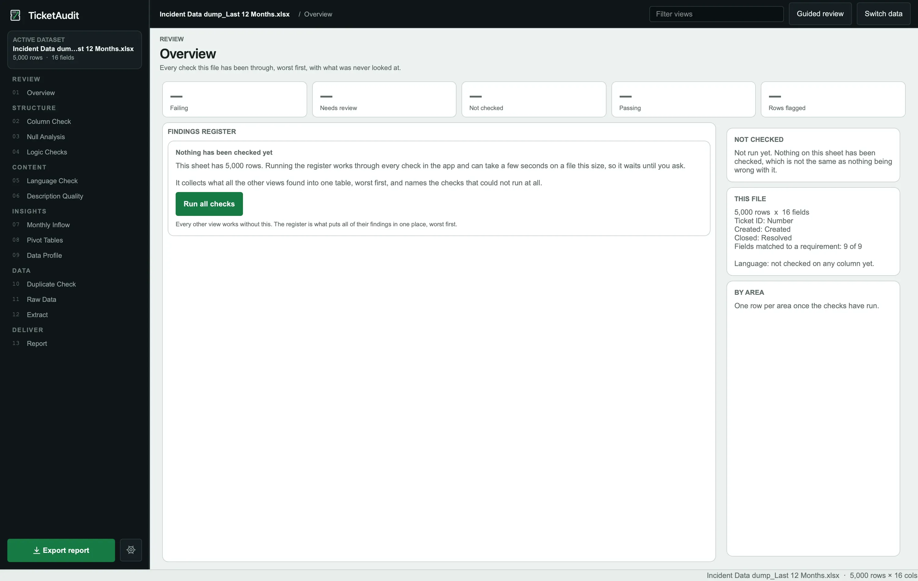
Leading descriptive analysis, text analysis, and dashboard reporting work that helps teams understand patterns at scale, prioritize what matters next, and communicate performance with confidence.
Analyzed 100+ datasets containing millions of data points to support strategic decision-making.
Used text analysis on unstructured feedback to surface customer trends and market signals.
Built interactive dashboards that make trends, outliers, and business priorities easier to see quickly.
Presented senior stakeholders with clear reports while protecting trust in the data through QA protocols.
Scale
100+
A mix of structured and unstructured data, from tickets and customer feedback to finance and operational reporting.
Lift
15%
The value was not only in reporting the signal, but in helping teams act on it in practical ways.
Partners
Collaborated with marketing, finance, and product stakeholders to translate findings into shared priorities.
Trust
A clean narrative matters, but only when the underlying data is dependable enough to stand behind.
Experience Arc
Each role has moved closer to business-facing analytics: from structured delivery habits to reporting support, then into full-scale descriptive analysis, text analysis, and dashboard work.
08/2023 - Present
Accenture / Kolkata
07/2022 - 08/2023
Accenture / Kolkata
03/2022 - 05/2022
Accenture
Featured Projects
Two self-directed projects show different angles of how I work end-to-end — one a desktop tool that brings NLP clustering into a familiar Excel workflow, the other a statistical study that separates causal drivers from confounded correlations on a classic dataset.
Text Analyzer Pro
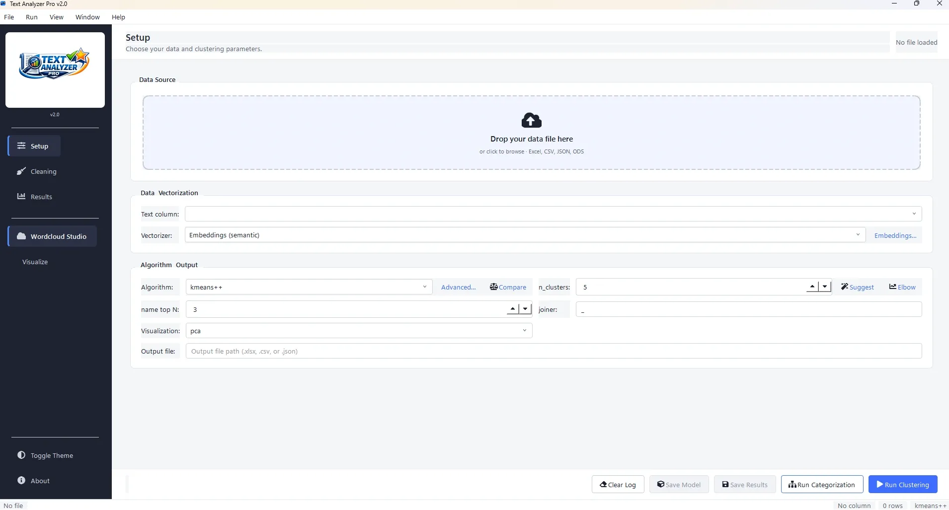
Python desktop app for clustering customer feedback, survey responses, and support-ticket text from Excel.
The project solves a practical gap: a lot of useful text data lives in spreadsheets, but turning that text into grouped themes usually requires coding. This tool brings TF-IDF, clustering, visualization, and export into a GUI-first workflow that non-technical users can navigate with much less friction.
Core workflow
Users can load Excel workbooks, choose sheets and text columns, run clustering, review suggested names, and save the results back into a familiar tabular format.
Analytical layer
The tool supports TF-IDF preprocessing with KMeans, DBSCAN, and Agglomerative clustering, then helps interpret results through keyword extraction and 2D views.
Power-user support
A Tkinter interface lowers the barrier for day-to-day use, while the CLI keeps the workflow repeatable for scripting, experimentation, and batch-oriented analysis.
Output value
It is well suited to customer feedback clustering, survey response grouping, support-ticket triage, and other analyst workflows where categorization speed matters.
Titanic Survival Analysis
Interactive EDA dashboard built on the titanic5 dataset, using chi-square tests, t-tests, and effect-size ranking to identify what actually drove survival.
This project asks a sharper version of a familiar question: which factors actually determined survival on the RMS Titanic, and which only look like they did? Working with the titanic5 dataset (1,309 passengers, only 3.9% missing ages, more complete than the popular Kaggle version), the analysis layers chi-square tests, Welch’s t-tests, odds ratios with 95% confidence intervals, and effect-size ranking to separate dominant drivers from confounded correlations.
Dataset choice
Uses titanic5 (1,309 passengers, 14 features from Encyclopedia Titanica) rather than the common Kaggle version, giving cleaner age data and a fuller manifest.
Statistical core
Combines chi-square tests, Welch’s t-tests, odds ratios with 95% confidence intervals, and effect-size ranking (Cramer’s V, point-biserial correlation) to support claims rather than just narrate them.
Key finding
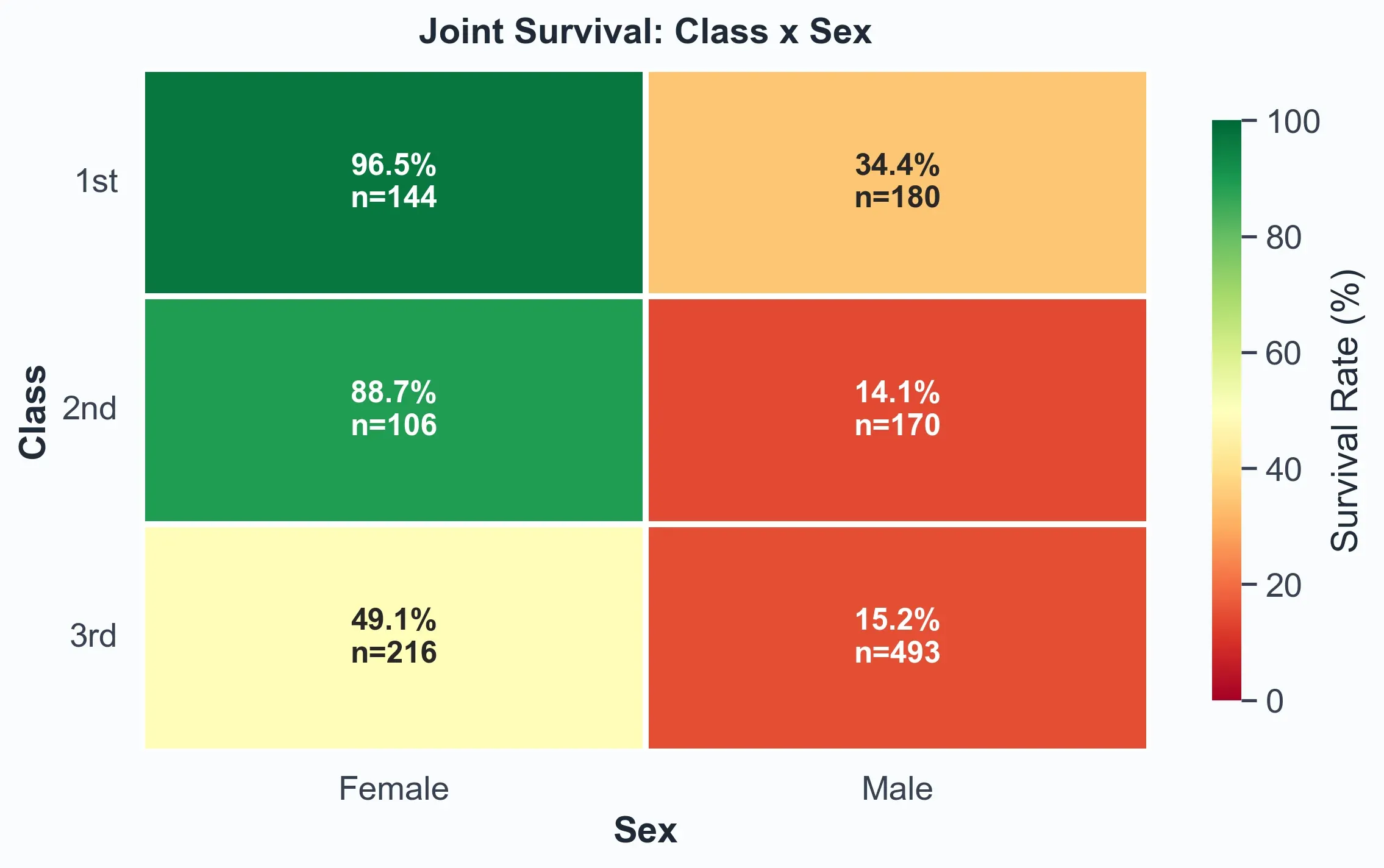
Sex emerges as the dominant predictor (Cramer’s V = 0.53, odds ratio 11.3x). Stratified analysis shows first-class women survived at 96.5% versus 15.2% for third-class men.
Delivered output
An interactive dashboard with odds ratios, effect-size rankings, a class-by-sex heatmap, and distribution plots, paired with a full DOCX report rendered inline.
Craft & Toolkit
A good portfolio should feel honest. This is the working stack behind the dashboards, analyses, internal tools, presentations, and delivery routines I rely on most often.
BI & visualization
Tools I lean on for reporting clarity, stakeholder visibility, and decision support.
Analysis & data
The core analytical layer for exploring data, validating quality, and extracting signal.
Internal tool building
Assisted by Claude Code, I ship practical internal products — turning recurring analysis, QA, and reporting tasks into guided, repeatable workflows with clearer outputs and less friction.
Working style
The habits that help analysis travel well across teams and decision-makers.
Credentials
Certifications keep the platform knowledge sharp. A computer science background provides the structure that supports the more practical day-to-day work.
Certifications
Claude Certified Architect: Foundations Verify ↗
Anthropic
Google AI Specialization Verify ↗
Google · Coursera
Power BI Data Analyst Associate Verify ↗
Microsoft · PL-300
Associate Data Practitioner Verify ↗
Google Cloud
Professional Data Engineer Verify ↗
Google Cloud
Azure Fundamentals Verify ↗
Microsoft · AZ-900
Security, Compliance, and Identity Fundamentals Verify ↗
Microsoft · SC-900
Education
B.Tech in Computer Science & Engineering
Diploma in Computer Science & Technology
Let’s Build
I enjoy the part between the query and the decision: the place where messy inputs become confident action. If that is the kind of partner you need, let’s connect.